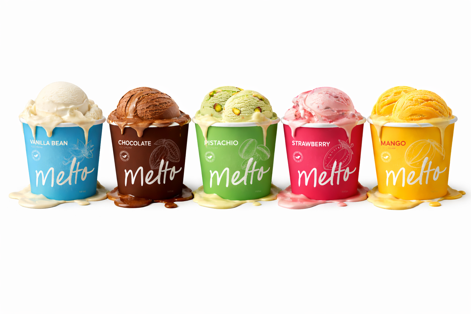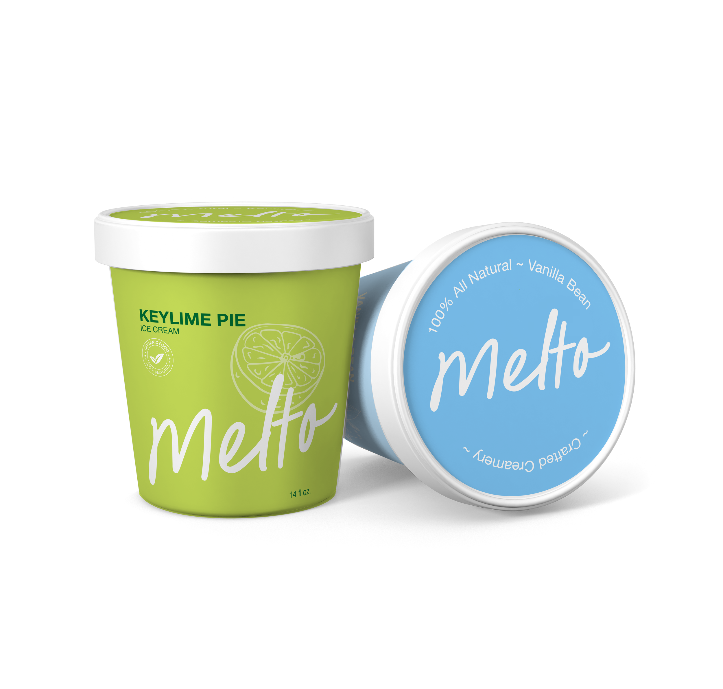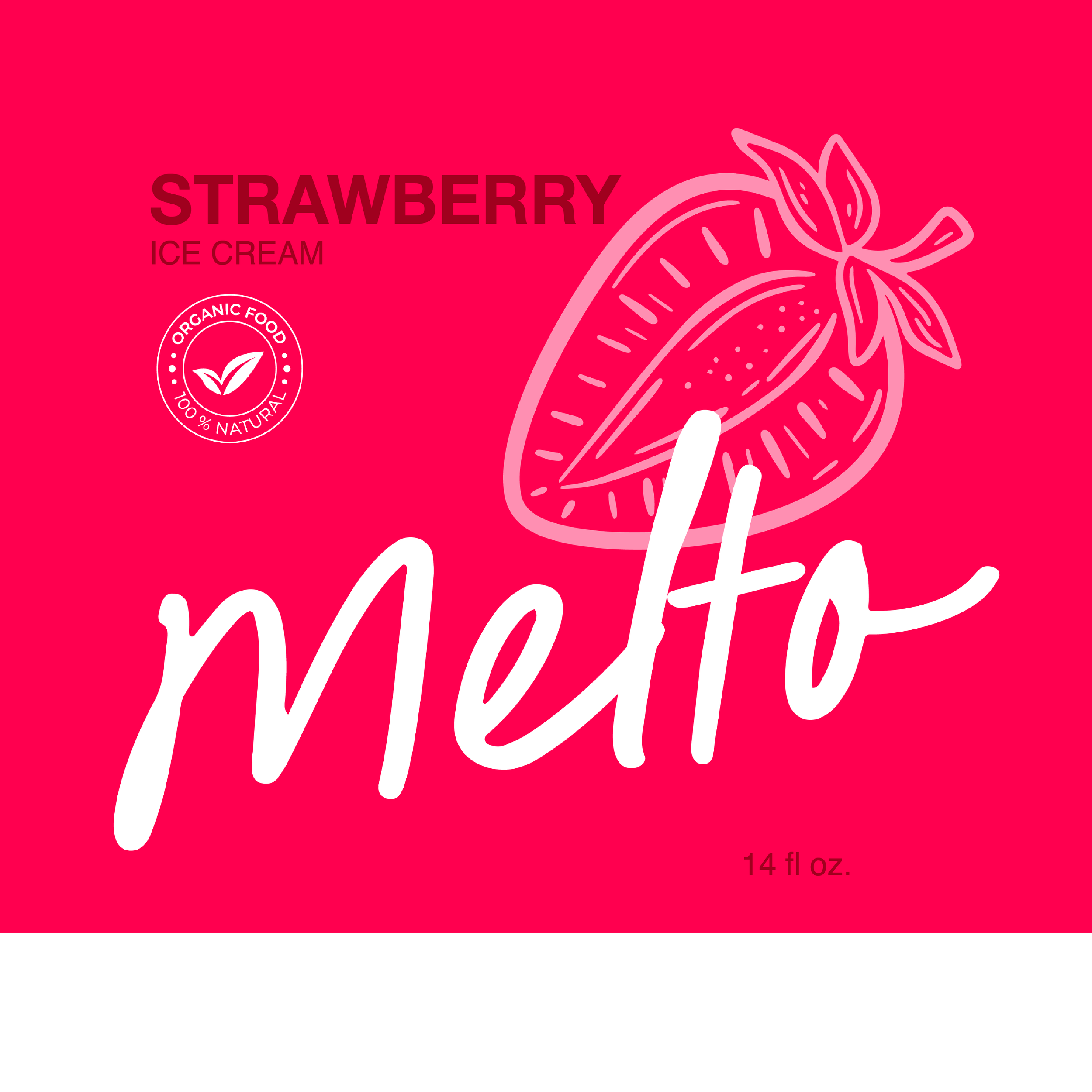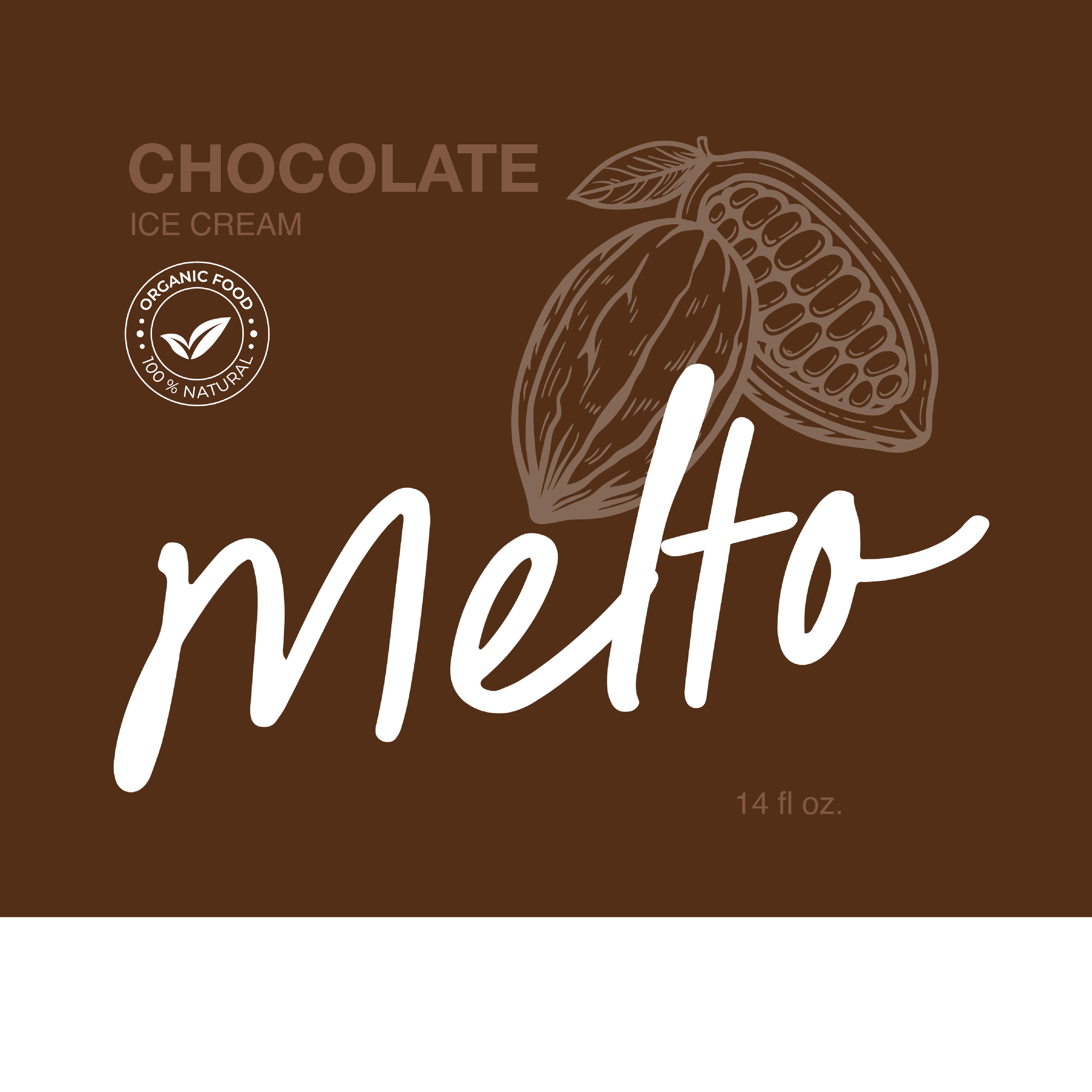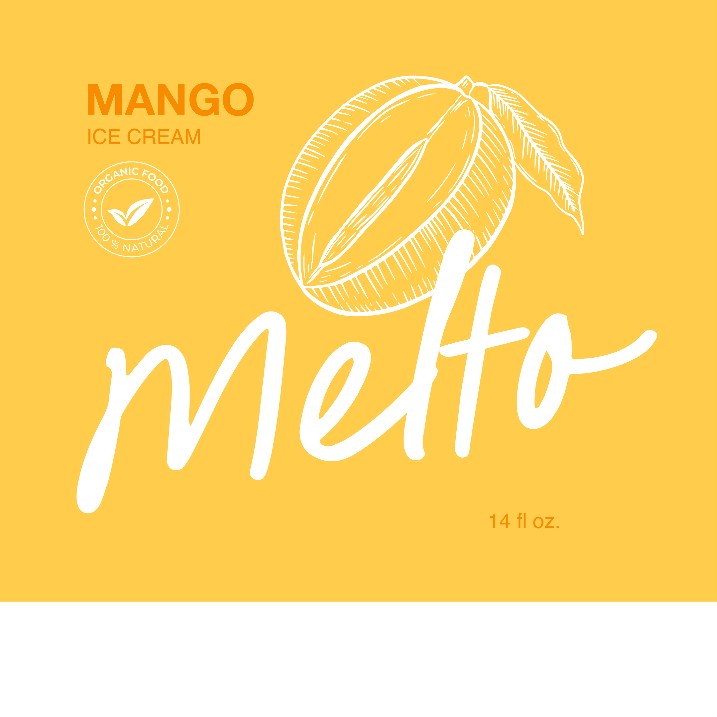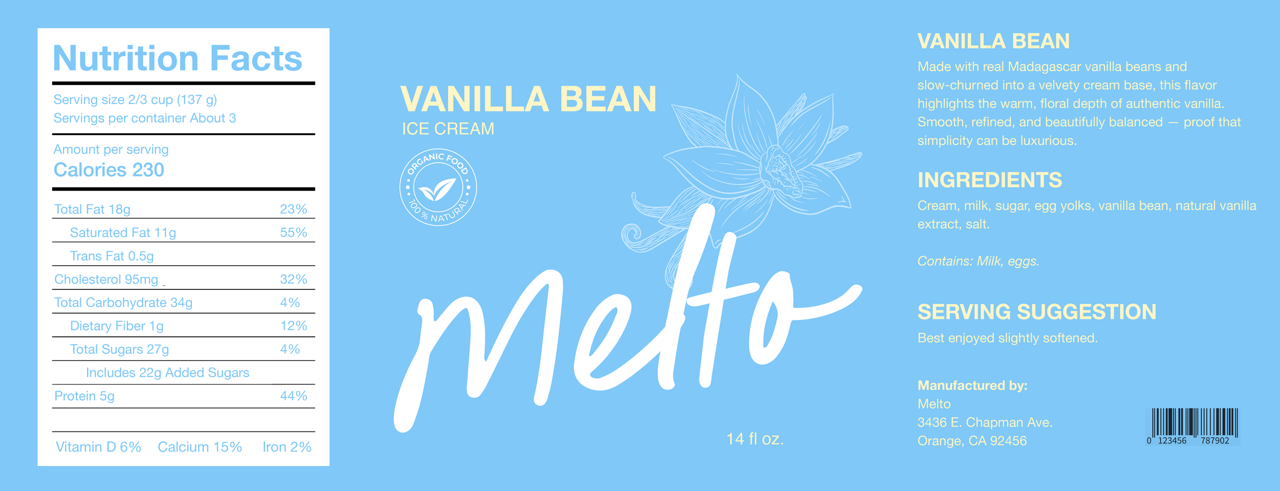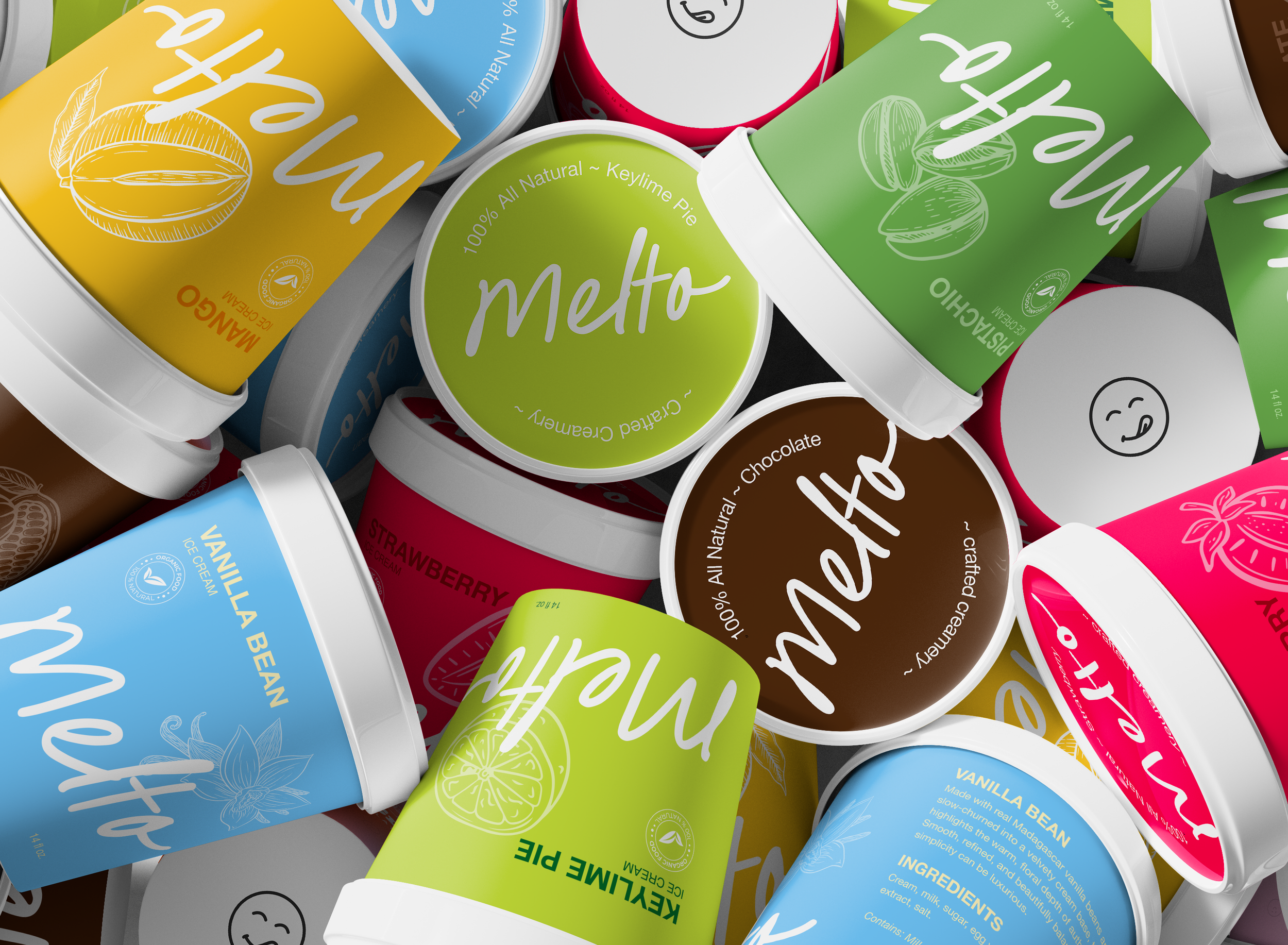
Melto Ice Cream
This ice cream collection uses a cohesive flavor system built on bold color blocking, minimalist typography, and ingredient-inspired line art.
A consistent layout keeps the brand unified, while distinct flavor colors create strong shelf impact and quick recognition.
The oversized “Melto” script adds warmth, balanced by clean sans-serif labeling for
a modern, premium finish—built to scale across retail and digital platforms.
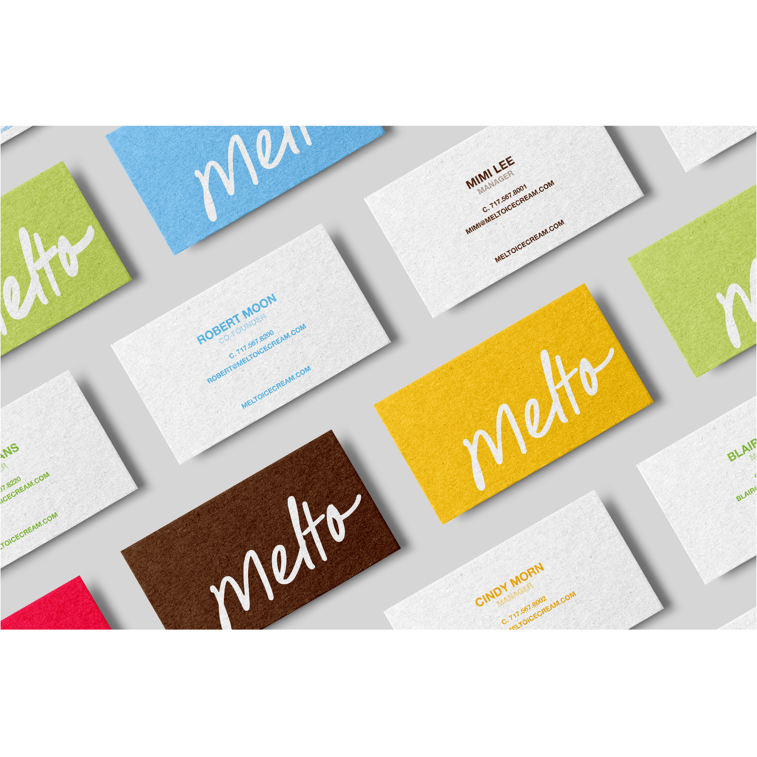
Identity and Packaging